


Concentrated points
…this idea is often expressed through the use of illusion or the manipulation of perception. Boguslawski might use techniques such as trompe-l'oeil to create the illusion of depth or three-dimensionality, or he might use abstract or surreal imagery to challenge the viewer's understanding of what is "real." Similarly, many artists throughout history have been interested in exploring the relationship between art and perception, asking questions such as: what is the role of the artist in creating reality? How do our experiences of art shape our understanding of the world around us?
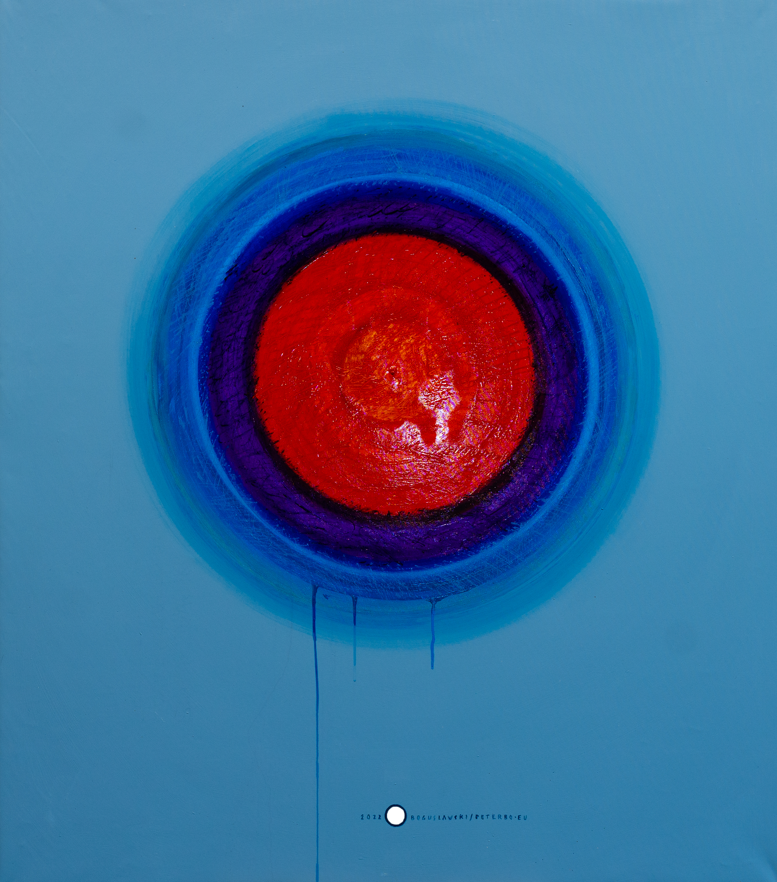
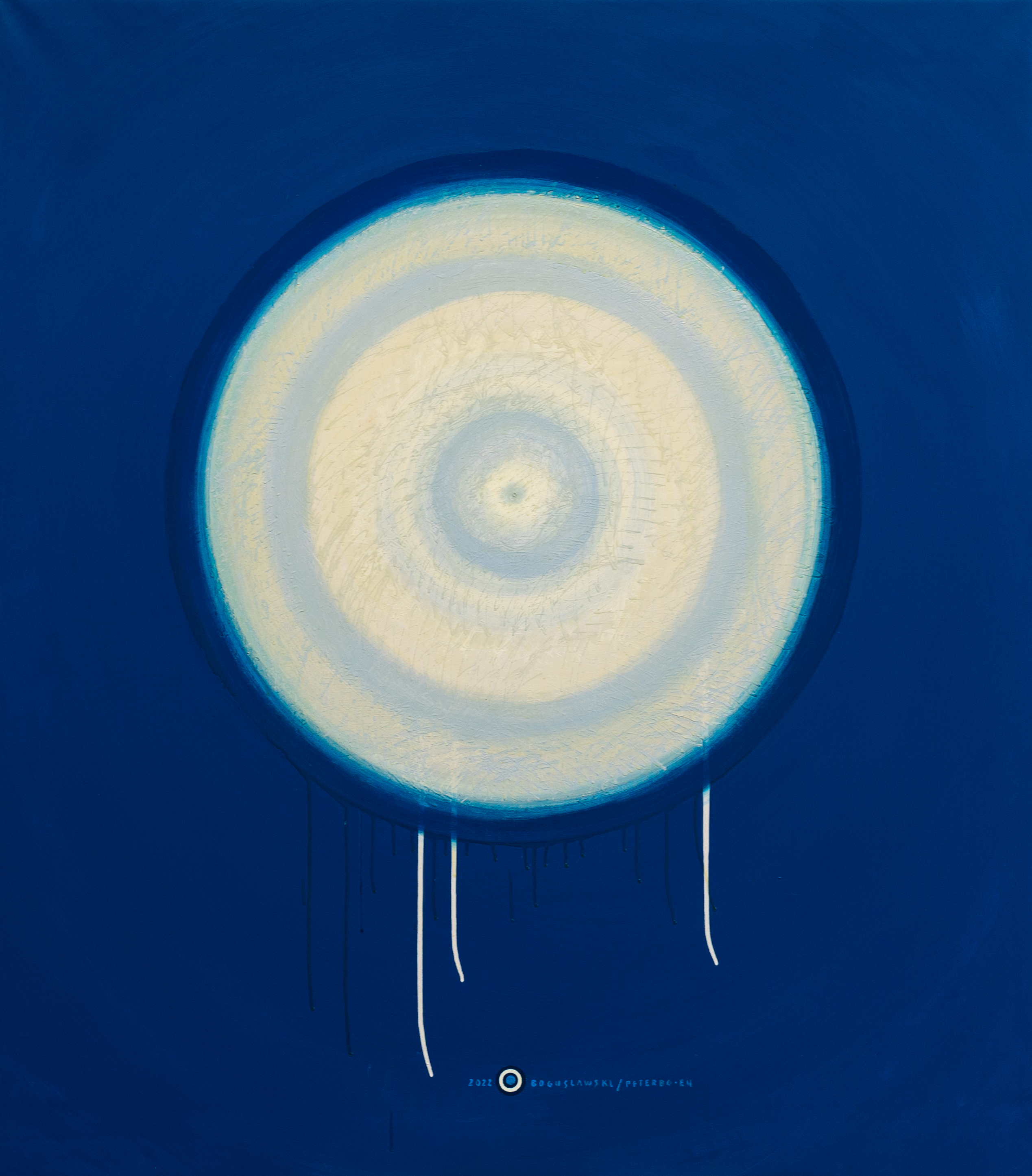
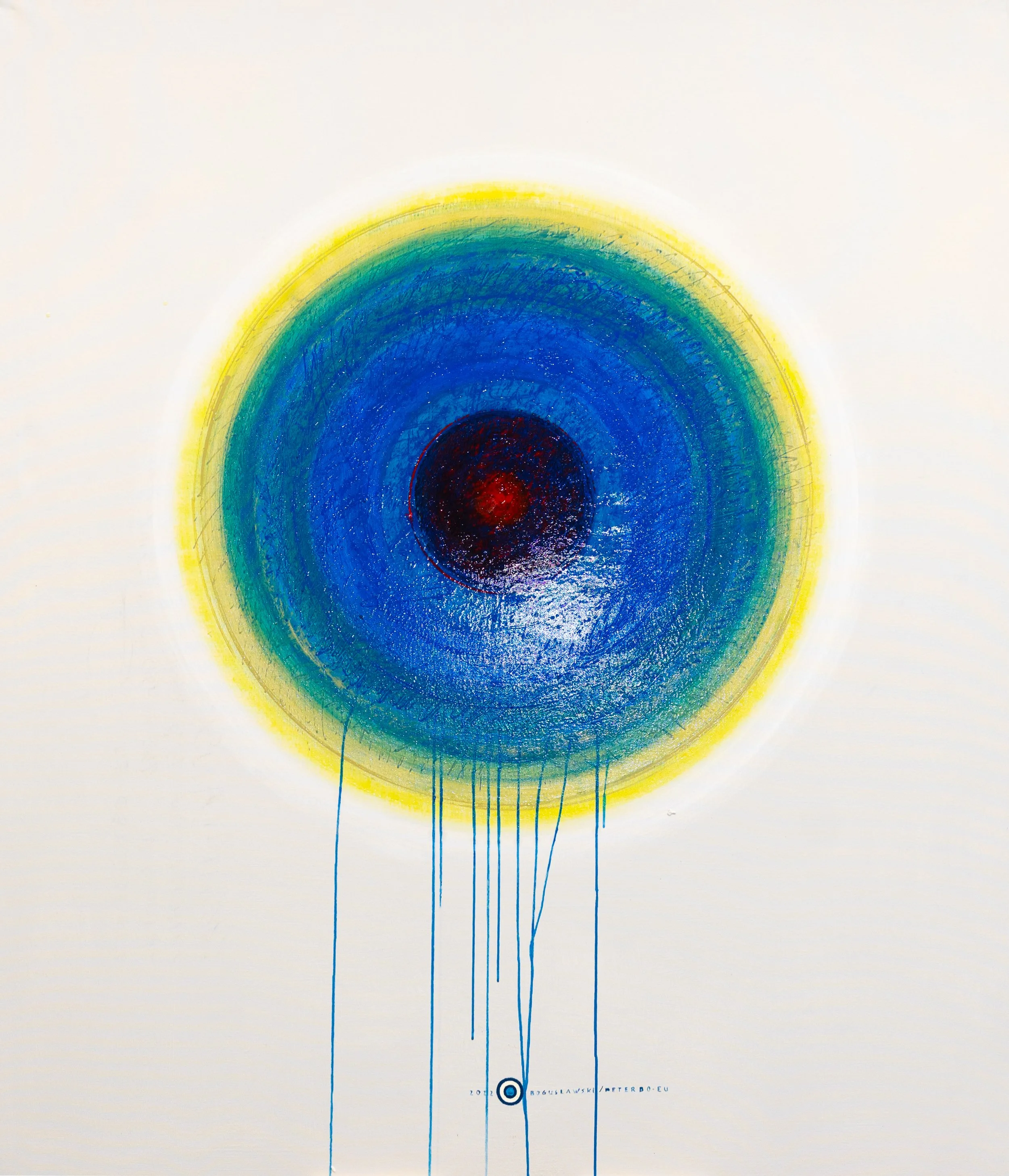
“Concentrate Point 1" Technique: Acrylic paint on canvas + polyurethane Size: 130 cm (width) x 150 cm (height)
Visual Proportion: Concentrate Point 1
“Concentrate Point 8" Technique: Acrylic paint on canvas + polyurethane Size: 130 cm (width) x 150 cm (height)

Visual Proportion: Concentrate Point 25
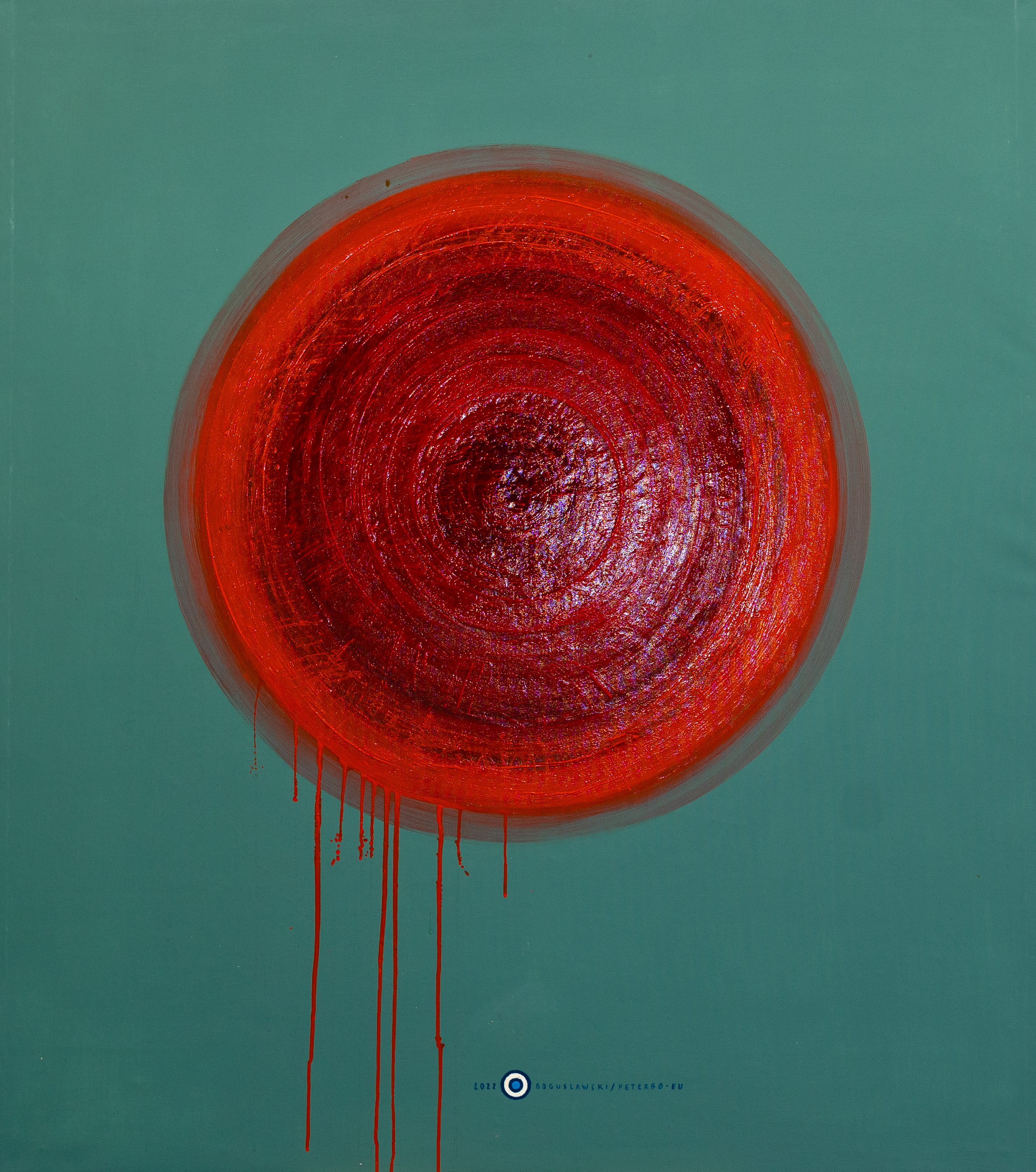
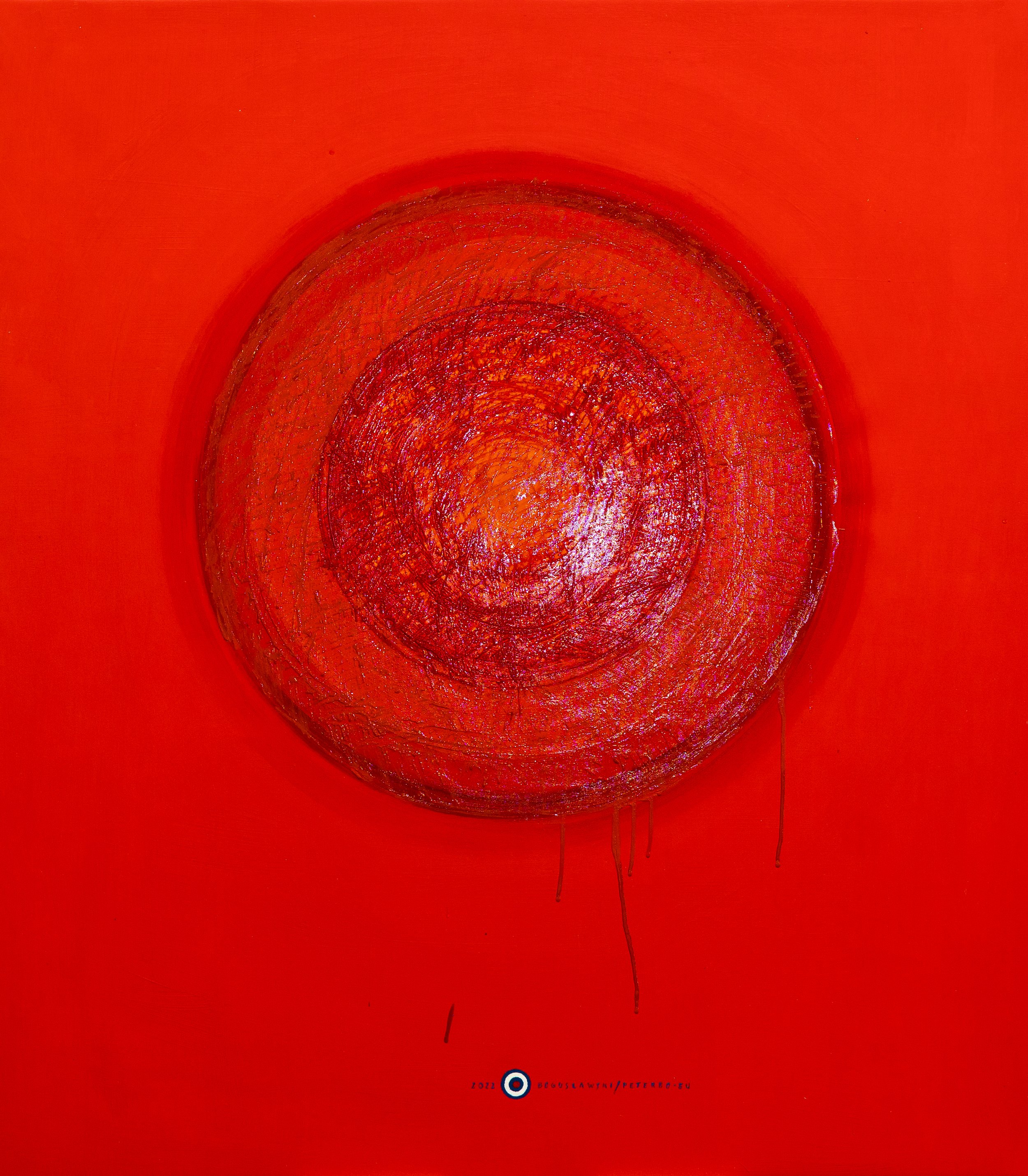
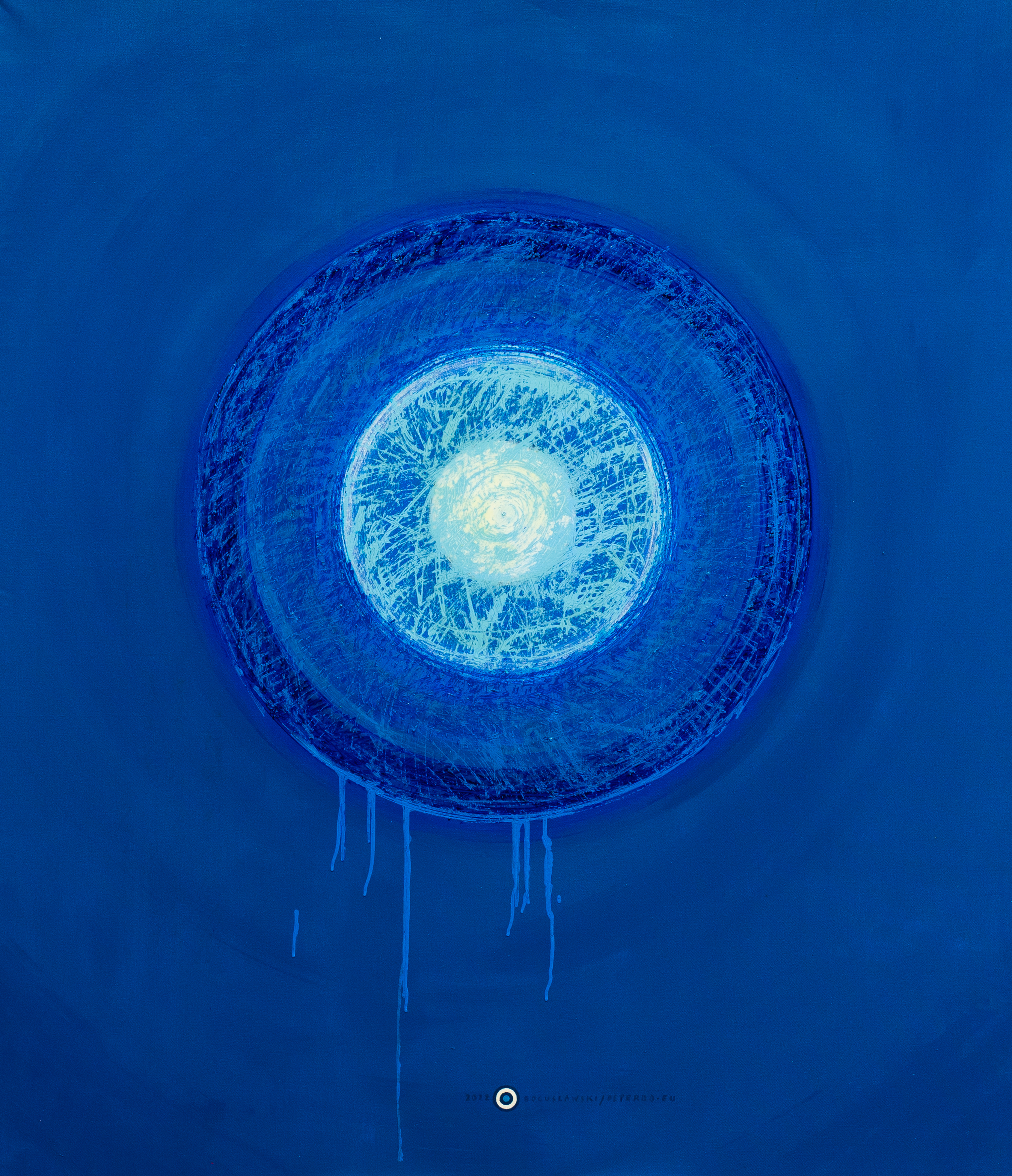
“Concentrate Point 8" Technique: Acrylic paint on canvas + polyurethane Size: 130 cm (width) x 150 cm (height)

Visual Proportion: Concentrate Point 8
“Concentrate Point 4" Technique: Acrylic paint on canvas + polyurethane Size: 130 cm (width) x 150 cm (height)

Visual Proportion: Concentrate Point 4
“Concentrate Point 11" Technique: Acrylic paint on canvas + polyurethane Size: 130 cm (width) x 150 cm (height)
Visual Proportion: Concentrate Point 11
“Concentrate Point 13" Technique: Acrylic paint on canvas + polyurethane Size: 130 cm (width) x 150 cm (height)

Visual Proportion: Concentrate Point 13
“Concentrate Point 16" Technique: Acrylic paint on canvas + polyurethane Size: 130 cm (width) x 150 cm (height)

Visual Proportion: Concentrate Point 16

“Concentrate Point 19" Technique: Acrylic paint on canvas + polyurethane Size: 130 cm (width) x 150 cm (height)

Visual Proportion: Concentrate Point 19
“Concentrate Point 27" Technique: Acrylic paint on canvas + polyurethane Size: 130 cm (width) x 150 cm (height)

Visual Proportion: Concentrate Point 27

“Concentrate Point 23" Technique: Acrylic paint on canvas + polyurethane Size: 130 cm (width) x 150 cm (height)

Visual Proportion: Concentrate Point 23

“Concentrate Point 30" Technique: Acrylic paint on canvas + polyurethane Size: 130 cm (width) x 150 cm (height)

Visual Proportion: Concentrate Point 30
Make it stand out.
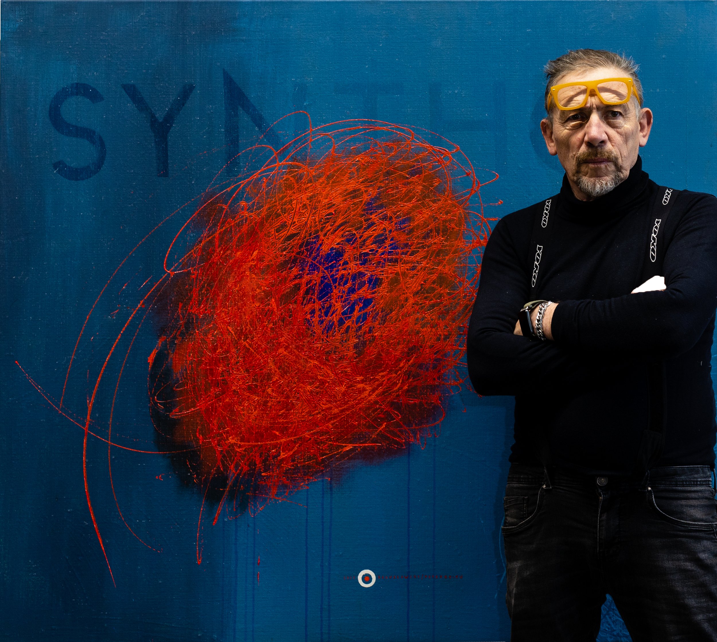
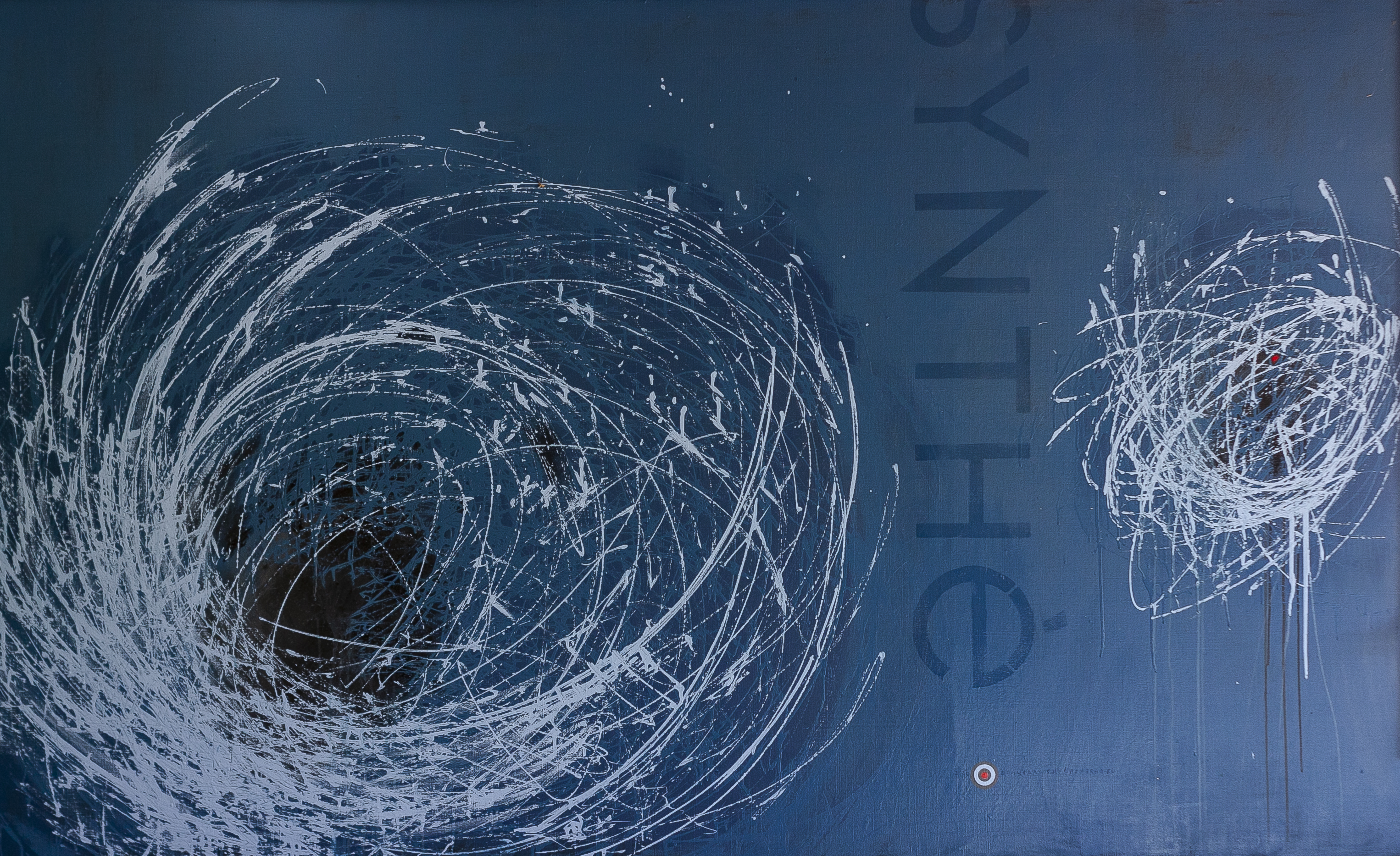
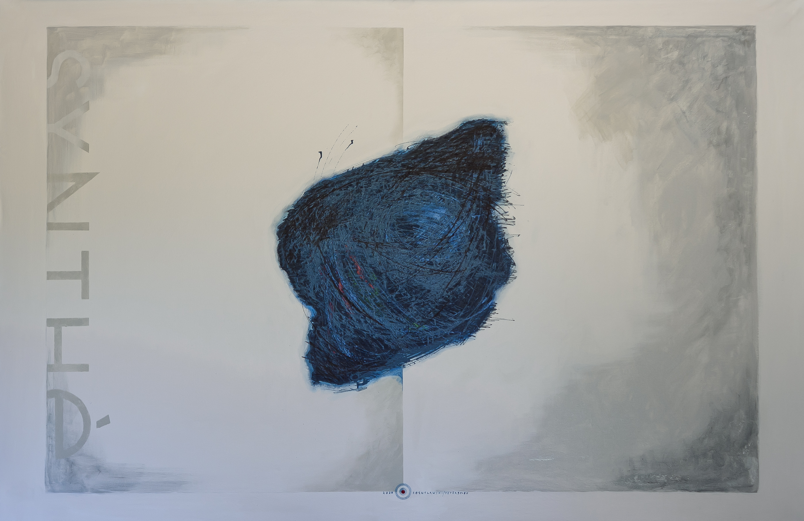
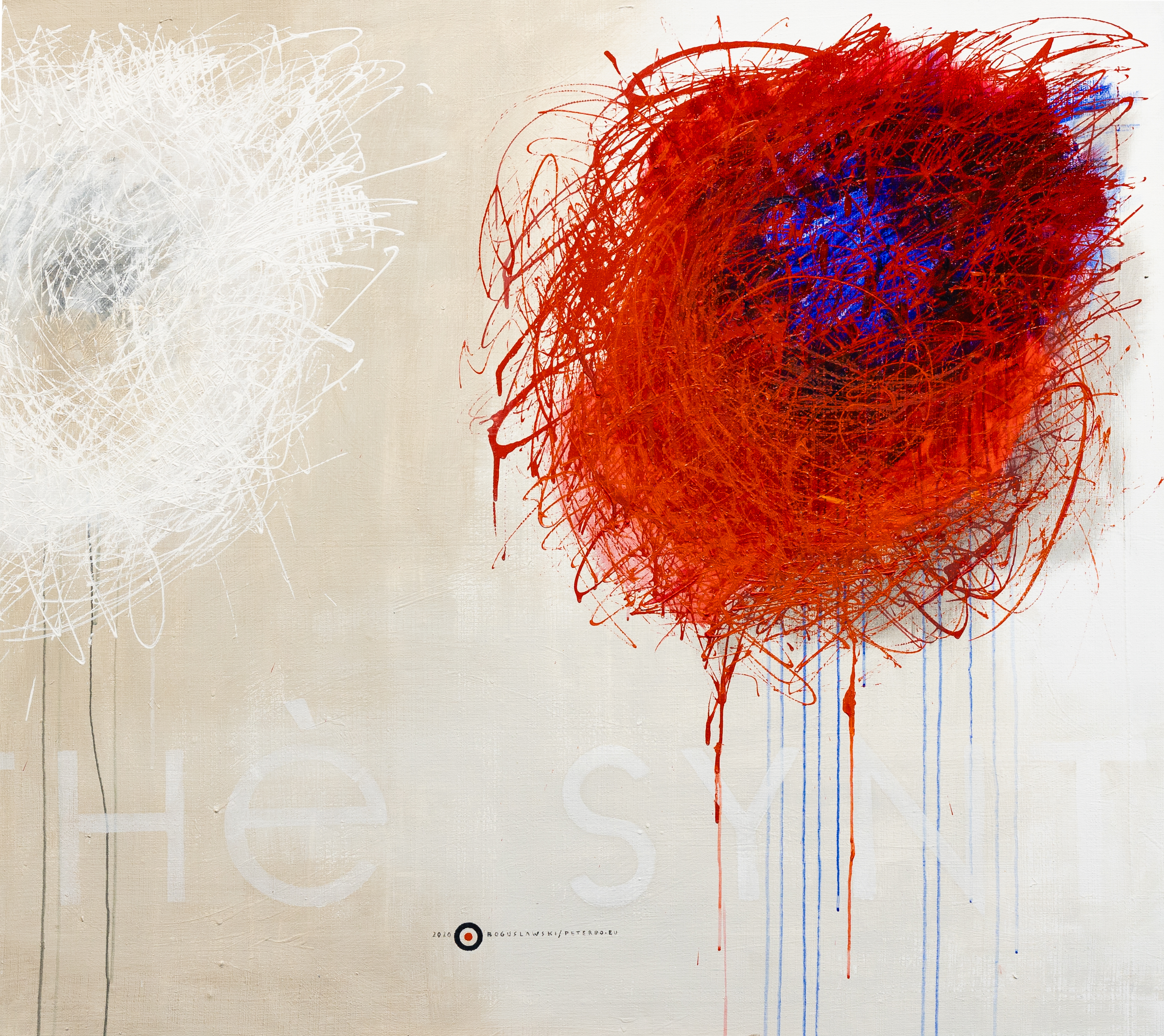
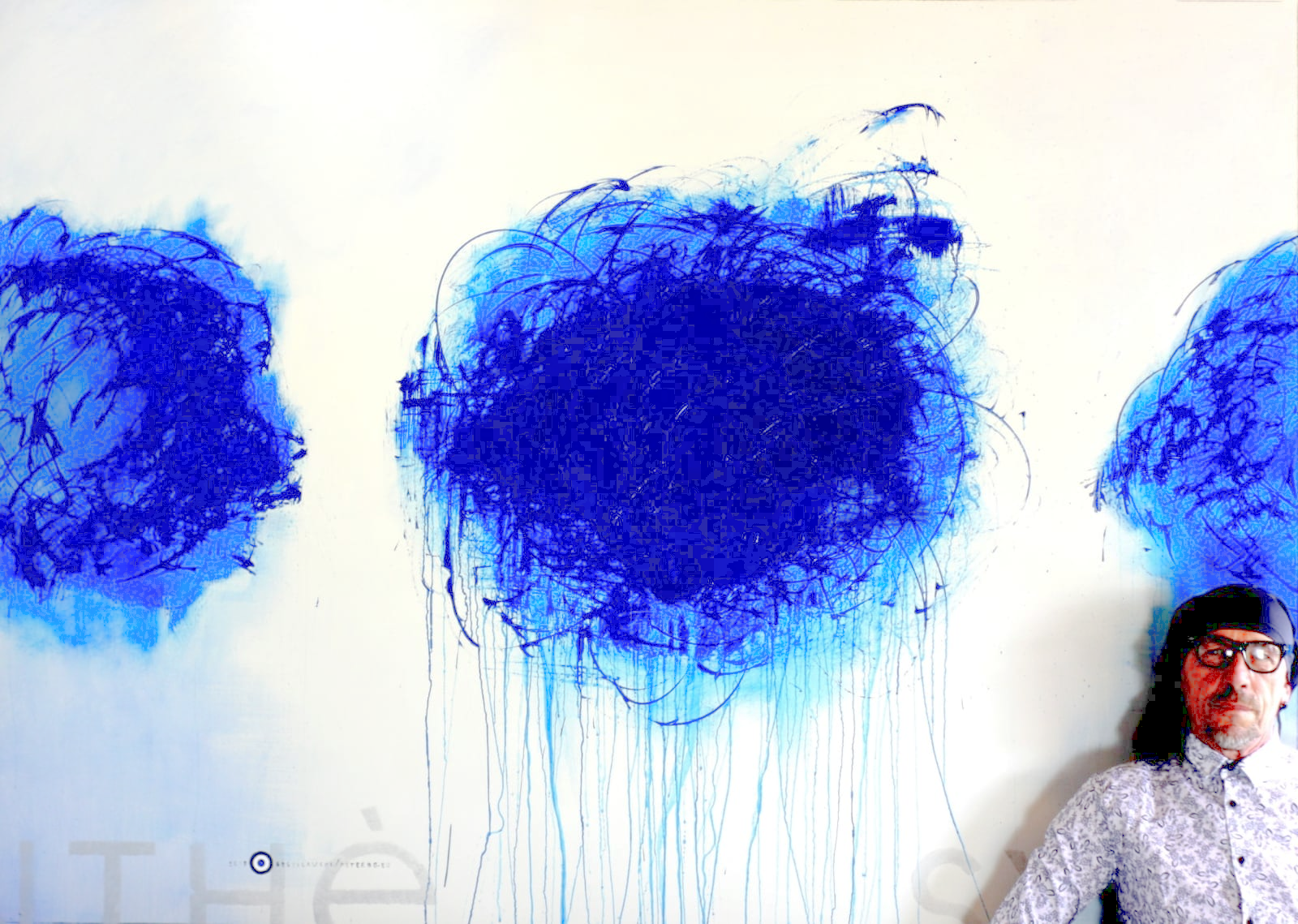
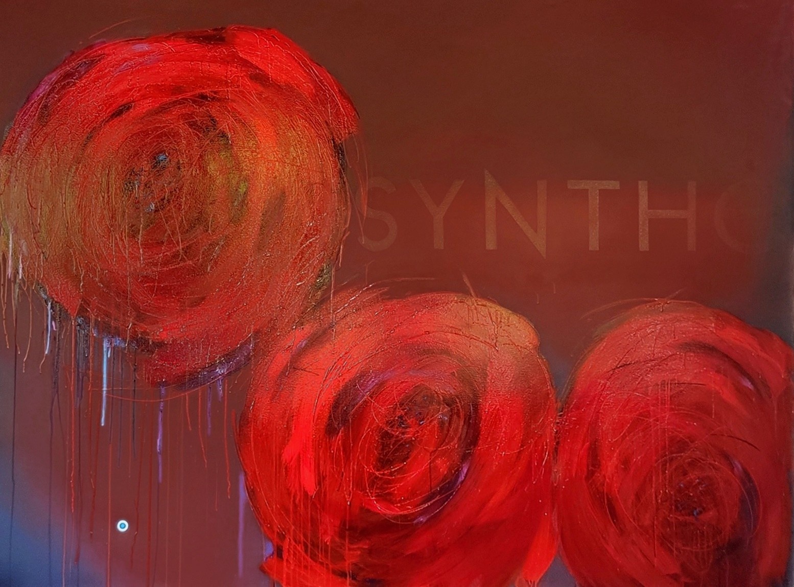
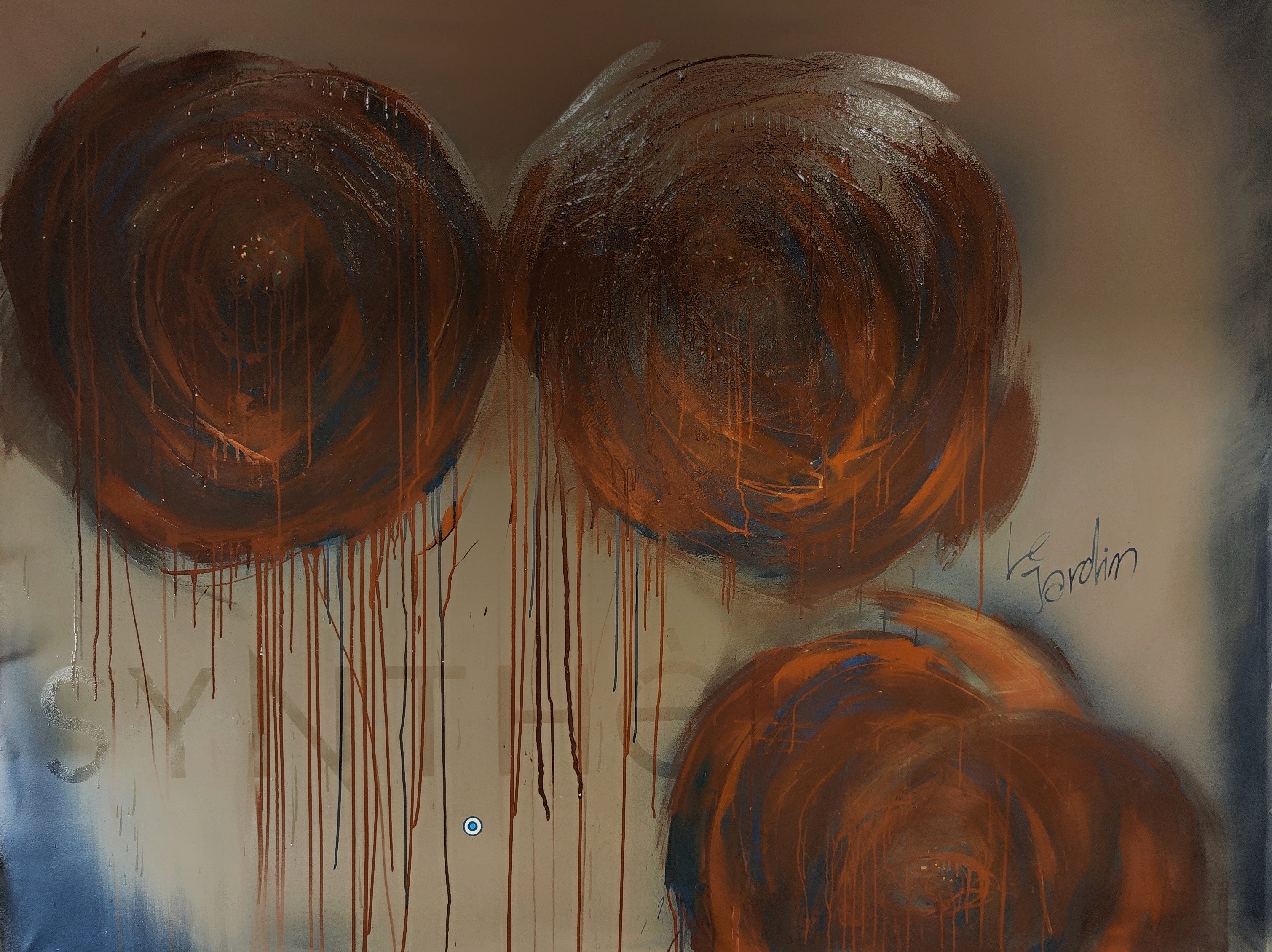
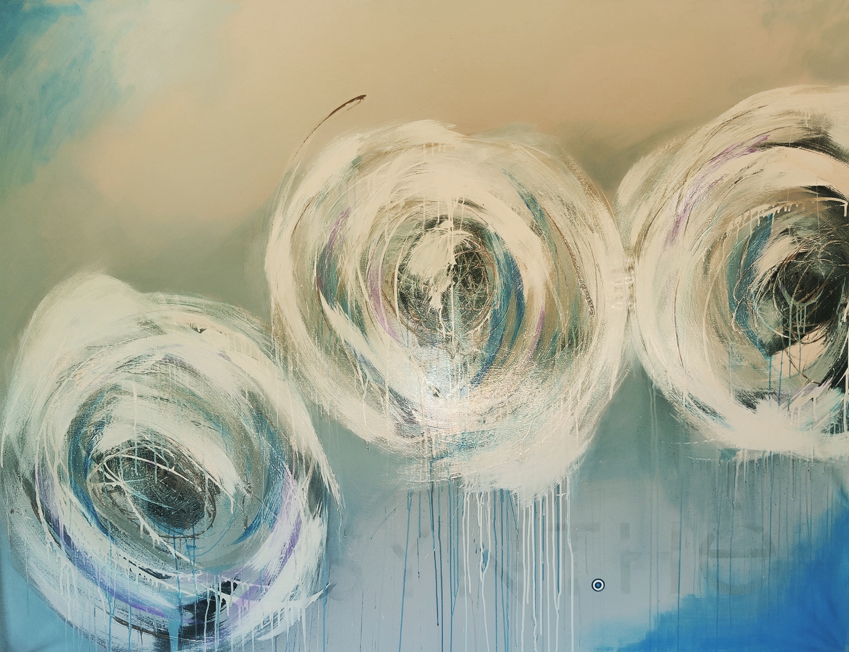
SYNTHE SERIES
“Synthe” is the artist's most numerous and varied painting series to date, with all of its paintings created in 2020-21.
On a dozen or so abstract, large-format canvases, the painter presents expressive combinations of colors and shapes that have the power to evoke strong emotions. Intense, saturated, and contrasting tints form the core of the artistic expression. Part of the composition shows a dynamic tangle of lines resulting from the injection of paint - an experimental method of applying it to the canvas. Other works show spots and stains that are difficult to define. The effects of their dripping, "pouring out" beyond their own limits seem spontaneous, unplanned, purely emotional, but the truth is just the opposite. This is a deliberately triggered effect.
Synthé's paintings clearly show the strict discipline of rhythm and proportion, even where there is asymmetry and the elements of the composition go beyond the frame.
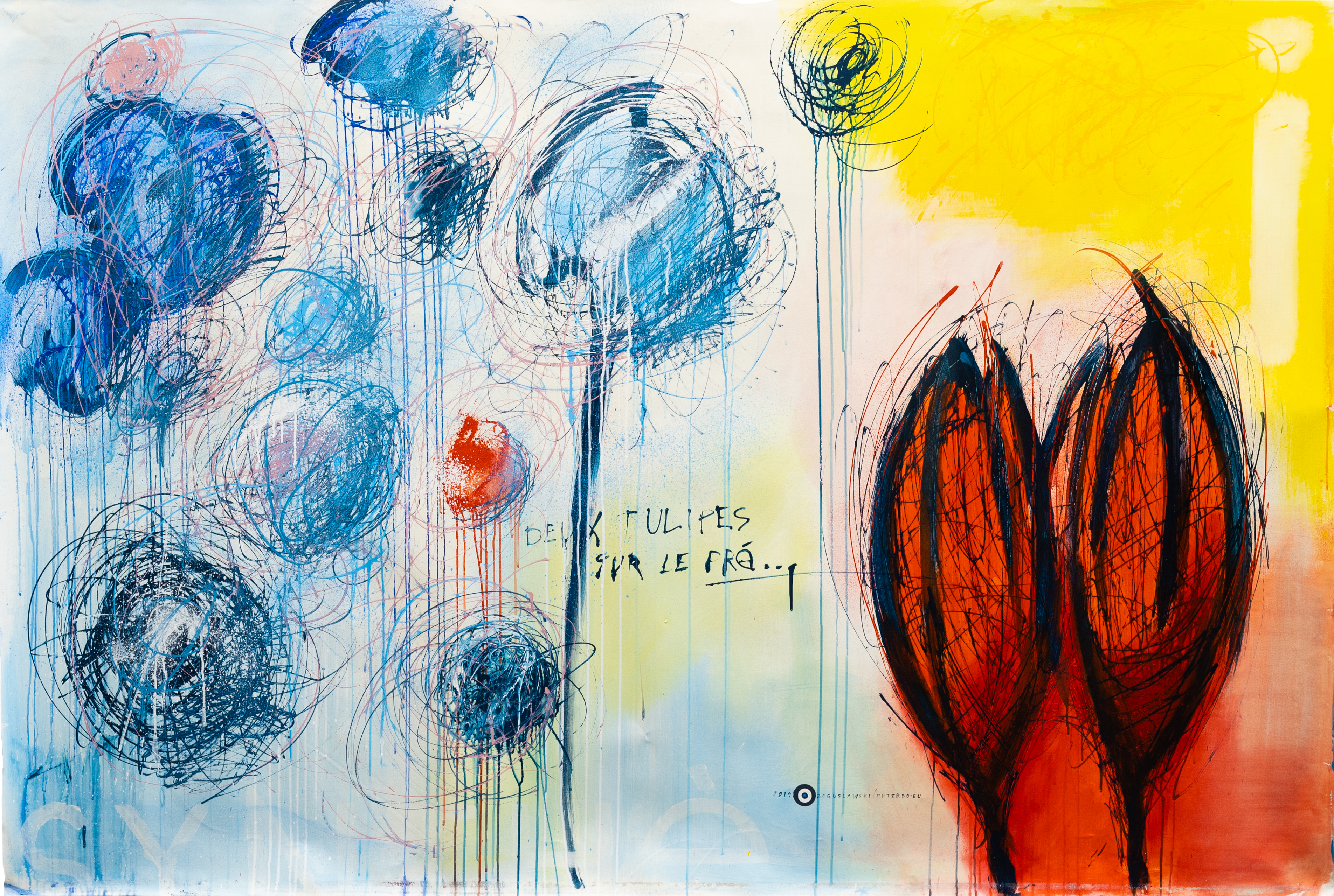
In several works, the author returns to the flower theme, which was the main theme of the "Le Jardin" series. Here, they are primarily a pretext to create color contrasts, tensions, rhythms, and dynamics in the self-imposed compositional assumptions.
Inspired by the works of Cy Twombly, the artist has added inscriptions on the canvases - words that "unmask" the visual layer of the work. The letters are scribbled or carefully designed, like the titles in an exclusive illustrated magazine. They are associated either with the aesthetics of street graffiti or professional advertising. However, each time it is about the same: strengthening the pictorial message through the use of an alternative method of communication. The painter is well aware of how advertisements have changed our perception of reality and adapts his works accordingly. This is not the first series in which he uses writing as one of the elements of the composition. By designating each work with his logo, the author additionally strengthens the suggestion that the painting is a commodity like any other.
The artist avoids self-interpretation of his works. In his opinion, the painting becomes concrete only when it comes into contact with the viewer's eyes. The visible result of his painting activities is the only noteworthy act of the artist's contact with the viewer.
Regardless of whether it is theoretical or emotional motivation, this series visibly reflects the painter's fascination with the art of the great American expressionists of the mid-twentieth century.

"Synthé XXII" - Technique: Acrylic paint on canvas, size: 140 cm (width) by 125 cm (height)
Visual Proportion: Synthé XXII
"Synthé XXIV. Earth I"- Technique: Acrylic paint on canvas, size: 140 cm (width) by 125 cm (height)

Visual Proportion: Synthé XXIV. Earth I

“Cross" Technique: Acrylic paint on canvas + polyurethane Size: 130 cm (width) x 150 cm (height)

Visual Proportion: Cross
"Synthé XXIII" - Technique: Acrylic paint on canvas, size: 220cm (width) by 150 cm (height)

Visual Proportion: Synthé XXIII

Synthé XXVI. Red Autumn - technique: acrylic paint on canvas, size: 220 cm wide by 150 cm high

Visual Proportion: Synthé XXVI. Red Autumn
Synthé XXV. Earth II- technique: acrylic paint on canvas, size: 220 cm wide by 150 cm high

Visual Proportion: Synthé XXV. Earth II
Synthé XXI - technique: acrylic paint on canvas, size: 140 cm wide by 125 cm high

Visual Proportion: Synthé XXI
Synthé. Deux Tulipes Sur Le Pre - technique: acrylic paint on canvas, size: 200 cm wide by 140 cm high

Visual Proportion: Synthé. Deux Tulipes Sur Le Pre

Synthé III - technique: acrylic paint on canvas, size: 200 cm wide by 140 cm high
Visual Proportion: Synthé III
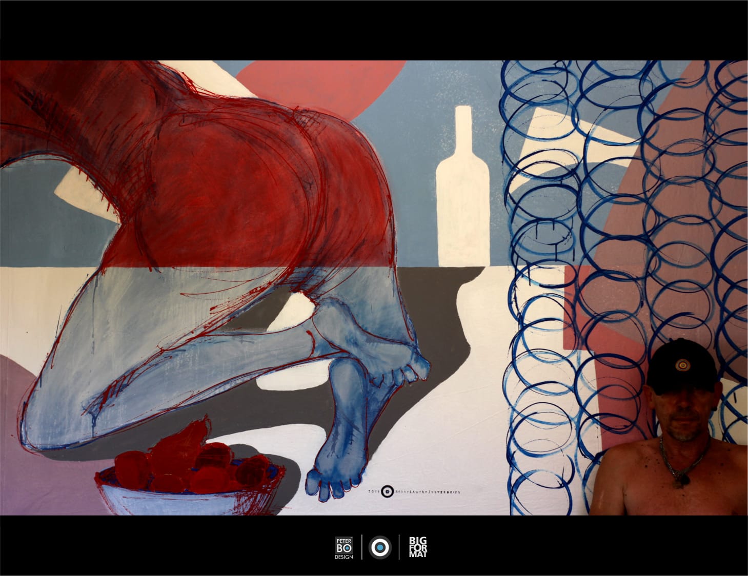
Pictures from Le Jardin series were created with spacious interiors in mind, making lyrical still lifes portraying flowers a perfect match. This is the most poetic and decorative series of paintings in the artist's entire oeuvre. The images often feature the motif of the Royal Protea, a plant introduced to European gardens from South Africa. It is also known as the Prometheus flower due to the petals resembling the flames of a freshly lit fire.
Sensual still lifes from the Le Jardin series present a feast for the eyes with intense, almost fluorescent colors, while the open compositions heighten the dreamlike mood of the works. The contours of the flowers are softened by blur and drops of sprayed paint, with their vivid colors subtly blending into the hues of the complementary background, creating a visually stimulating sensorial suggestion. The effects of dripping paint not only intensify the impression of abundance and richness but also exemplify the artist's fascination with the painting materials used.
The series as a whole is imbued with the joy of sensually communing with the gifts of nature, including fruits and flowers, yet retains a hint of the predatory expression characteristic of all of Bogusławski's paintings.
"Le Jardin 2" Technique: Acrylic paint on canvas + polyurethane Size: 200 cm (width) x 150 cm (height)

Visual Proportion: Le Jardin 2
"Le Jardin 4" Technique: Acrylic paint on canvas + polyurethane Size: 200 cm (width) x 150 cm (height)

Visual Proportion: Le Jardin 4
"Le Jardin 1" Technique: Acrylic paint on canvas + polyurethane Size: 200 cm (width) x 150 cm (height)

Visual Proportion: Le Jardin 1

Le Jardin All Visual

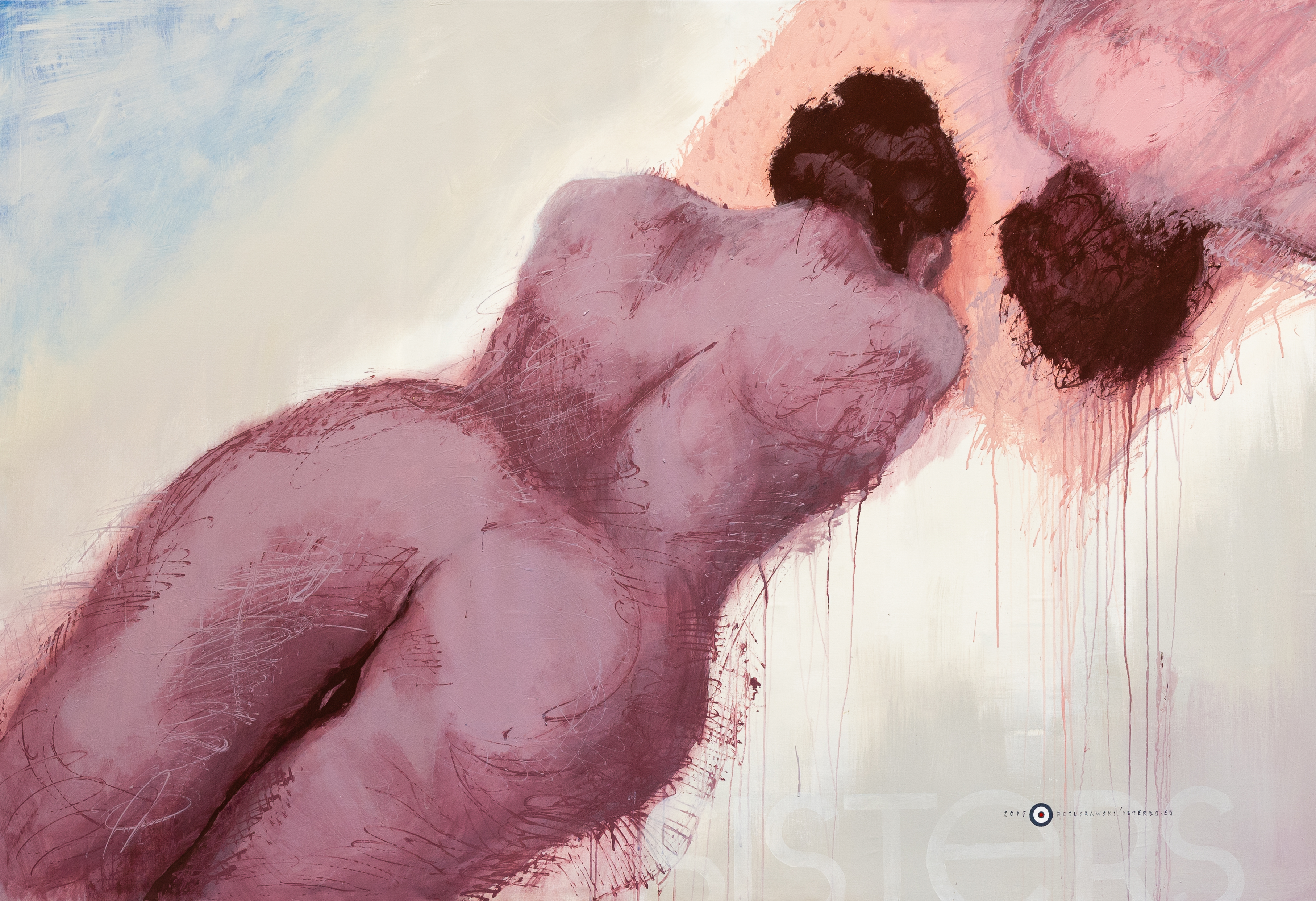
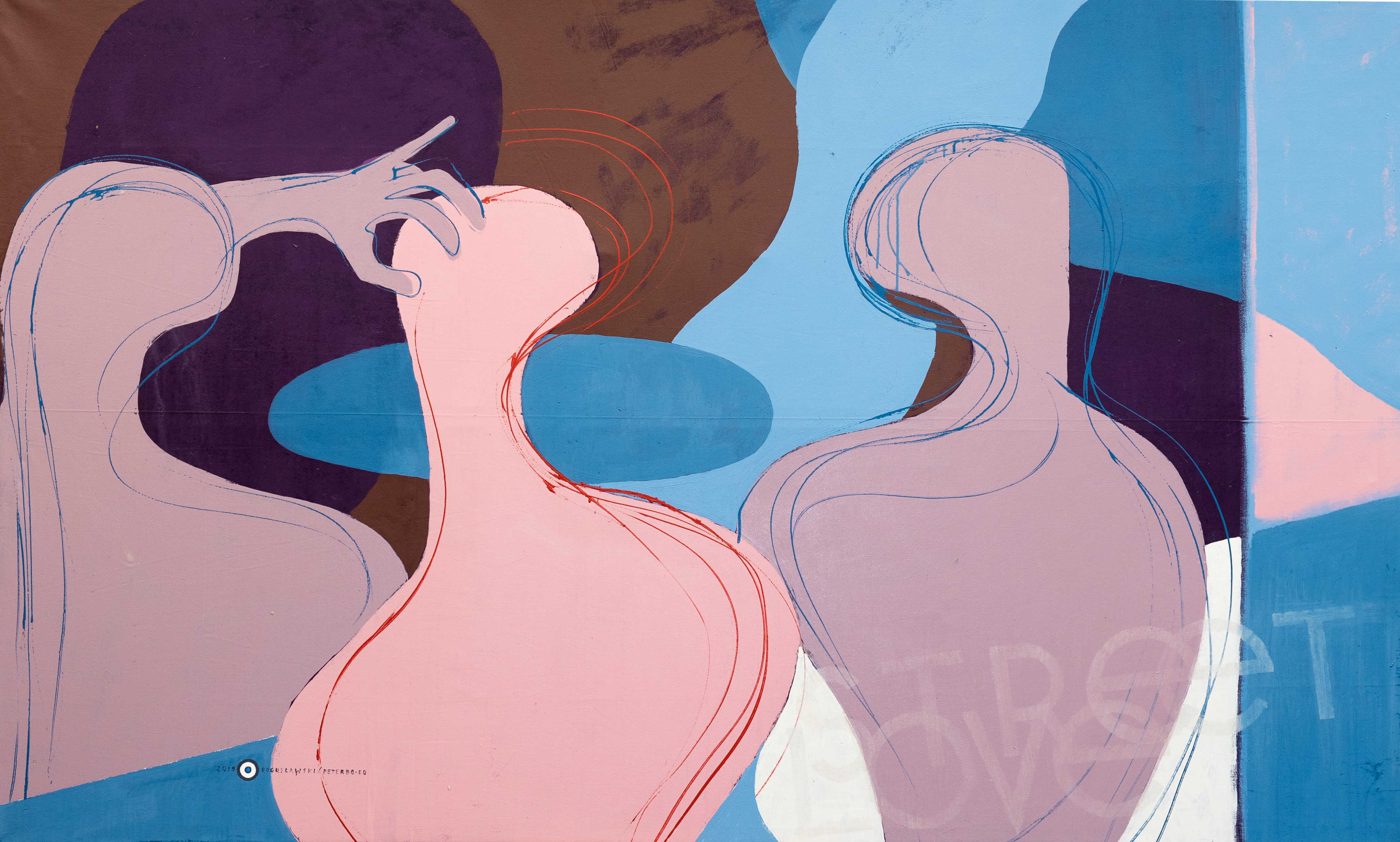
Sisters series
Embarking on a transformative journey through the canvas, this series showcases two masterful paintings that evoke the intricate symphony of femininity. Each artwork stands as a visual poem, capturing the boundless allure of women and celebrating the myriad facets of their existence.
Painted primarily in soft hues of pink and beige, the artist skillfully evokes not just the visual, but the sensory experience of the female essence. These colors, while gentle, carry a powerful message. They seem to hold within their confines the very taste and aroma of womanhood—a tactile intimacy that beckons viewers to not just see, but to feel and to inhale the deeper, almost mystical, essence of the subjects depicted.
The rhythm and composition, central themes of these paintings, play a dexterous dance upon the canvas. At a cursory glance, the arrangement may seem serendipitous or even enigmatic. But as one delves deeper, the deliberate orchestration of forms becomes apparent. There's a calculated precision, akin to a musical composition where every note, no matter how subtle, has its place and purpose.
Paintings an unexpected yet captivating analogy, the female forms in these artworks are arrayed reminiscent of fish displayed in a bustling market. This comparison, bathed in vibrant shades of orange, adds a layer of raw authenticity. The bodies, with their unique silhouettes and postures, stand side by side—much like fish with their individual patterns and hues yet lying harmoniously next to each other. It's a celebration of both individuality and unity, of nature and womanhood in their purest forms.
In "Resonance & Harmony," the artist invites us to transcend the mere act of observation. It's an invitation to engage, to resonate with the rhythms of the depicted femininity, and to appreciate the profound depths of beauty and complexity that lie therein. The two paintings, though distinct, come together to weave a tale of women in all their splendor, likening their graceful cadence to the organic beauty of nature's offerings.
“Concentrate Point 16" Technique: Acrylic paint on canvas + polyurethane Size: 130 cm (width) x 150 cm (height)

Visual Proportion: Sister 32
“Concentrate Point 16" Technique: Acrylic paint on canvas + polyurethane Size: 130 cm (width) x 150 cm (height)

Visual Proportion: Sisters 34

Dance series
“Dance” series was inspired by one painting - Henri Mattise's masterpiece under the same title. Each work in the series presents the same scene: people dancing in a circle. Bogusławski simplified this representation more than the original author and reduced it to the form of a sign, a symbol of community. The composition of the pictures is based on the contrast of the background colors (different shades of blue) and the figures in the foreground. In relation to Matisse's work, the painter brought the frame closer so that only the upper parts of the dancing figures are visible. As with the French master, only the process itself counts, the strong emotional bond between the dancers, symbolized by the uninterrupted circle in which they move. An interesting detail are the lines around the characters suggesting an intense spin (Dance II and Dance IV), giving these compositions more dynamics. These images glorify a relationship based on a strong bond in the group. The great, timeless, primal energy of the human community is released in front of the viewer’s eyes.
Dance II - technique: acrylic paint on canvas, size: 185 cm wide by 130 cm high

Dance III - technique: acrylic paint on canvas, size: 195 cm wide by 130 cm high
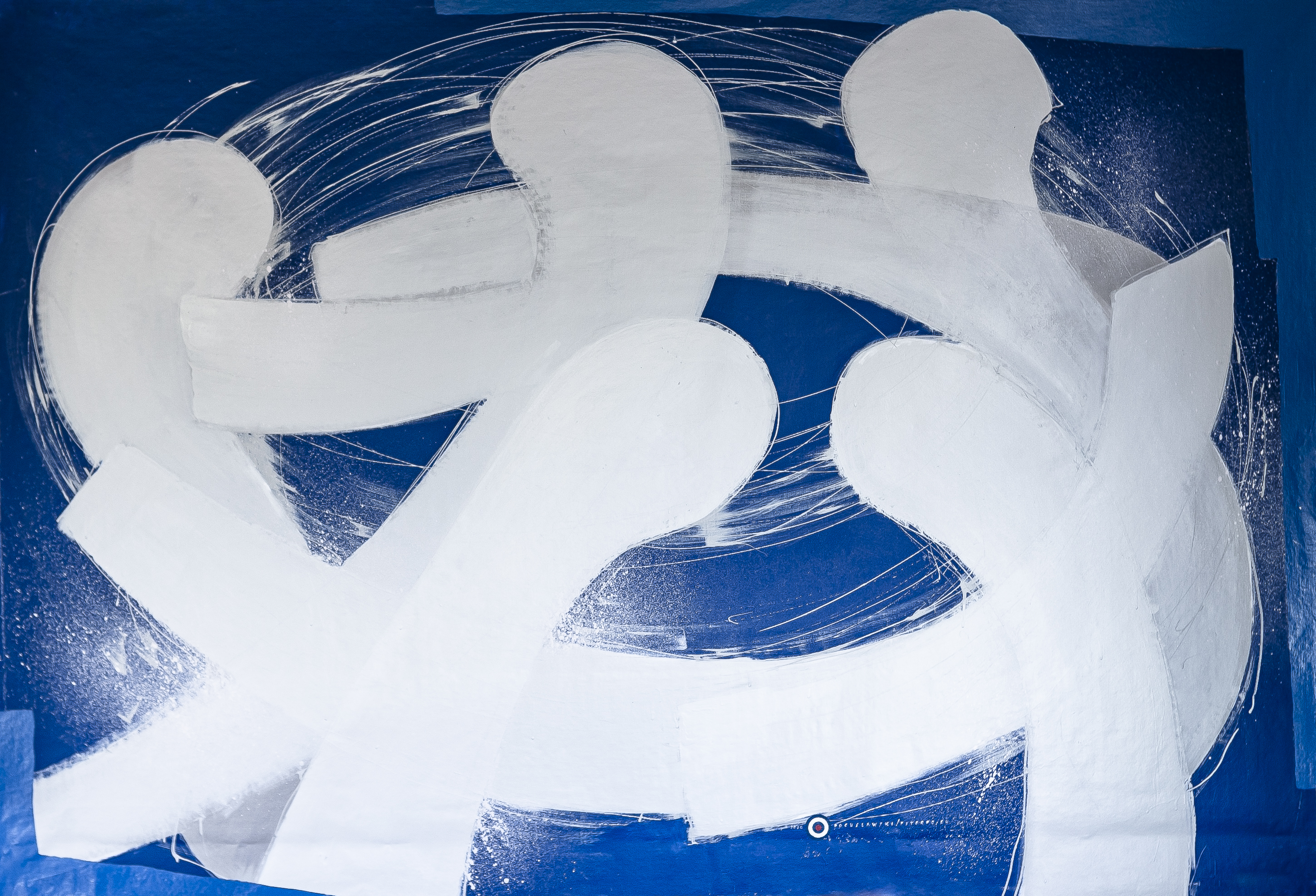
Dance IV - technique: acrylic paint on canvas, size: 220 cm wide by 150 cm high
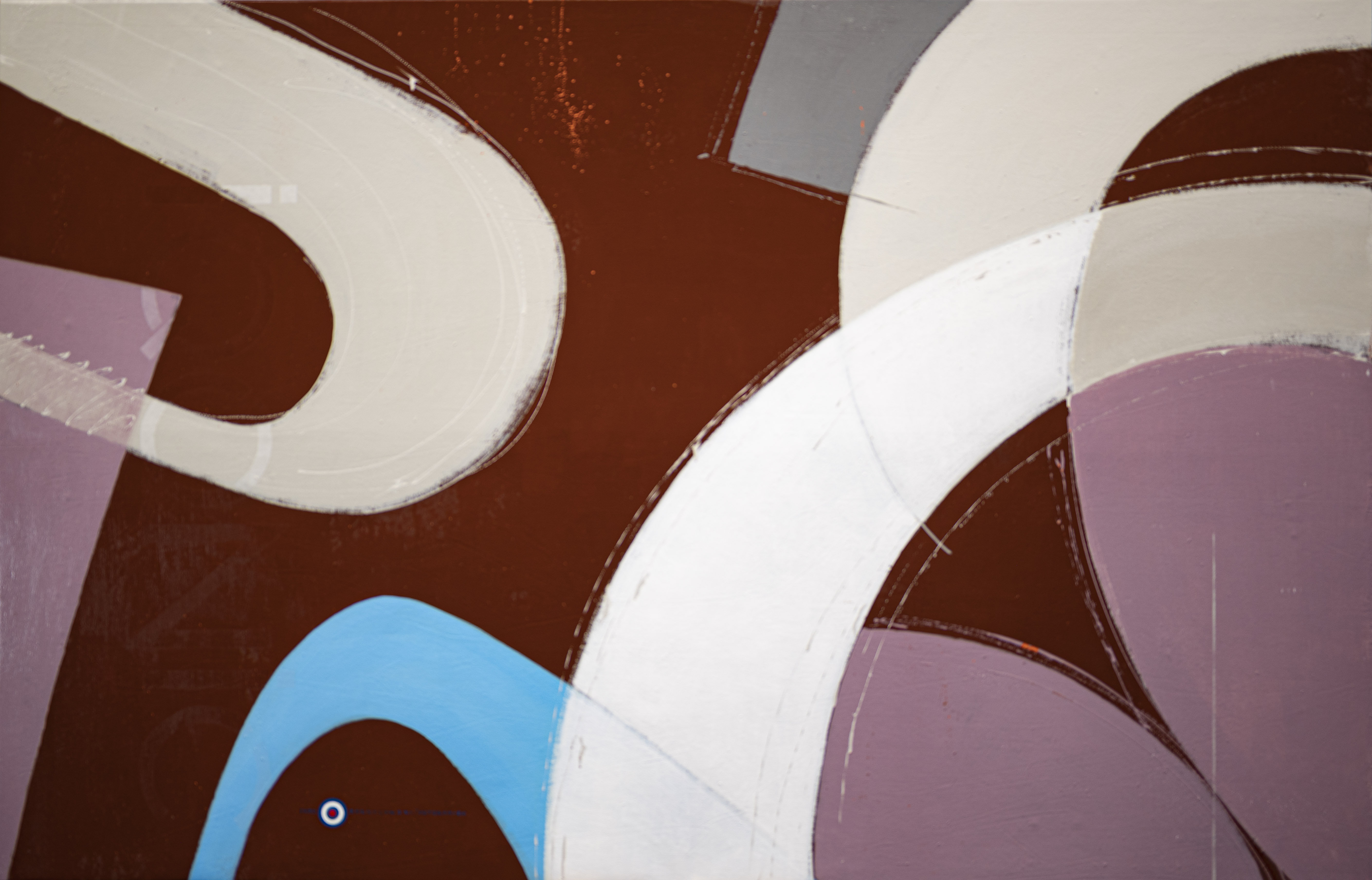
IQONIC series
In IQONIC series, the author underscores the role of imagery as a complementary element to architecture—serving as an object of primarily aesthetic function. Throughout this cycle, the painter embodies the postulates of both the Bauhaus school and Constructivism.
The artist has selected concrete cladding slabs as the substrates for several pieces within this series. Panels of this nature, when affixed to a wall, evoke a sense of raw, industrial interior. By employing these as a base for his paintings, the artist aims to meld painting with architecture, positioning the images as integral architectural elements.
Pieces from the "Colors" series depict colorful rings, rectangles, or stripes exhibiting non-uniform structures. These aren’t geometrically immaculate forms but rather painterly ideations of such shapes. The hue emerges as the main protagonist of these paintings, and in the piece titled "#pantone," the fundamental color range is the focal point.
The author has amalgamated the majority of works from this series into diptychs and triptychs, enhancing their architectural resonance as rhythmic accents within interior spaces.
Iqonic IV. Picnic on the Red Blanket - technique: acrylic paint on canvas, size: 210 cm wide by 138 cm high

Visual Proportion: Iqonic IV. Picnic on the Red Blanket
Iqonic II. Woman in Blue Stockings - technique: acrylic paint on canvas, size: 210 cm wide by 138 cm high

Visual Proportion: Iqonic II. Woman in Blue Stockings
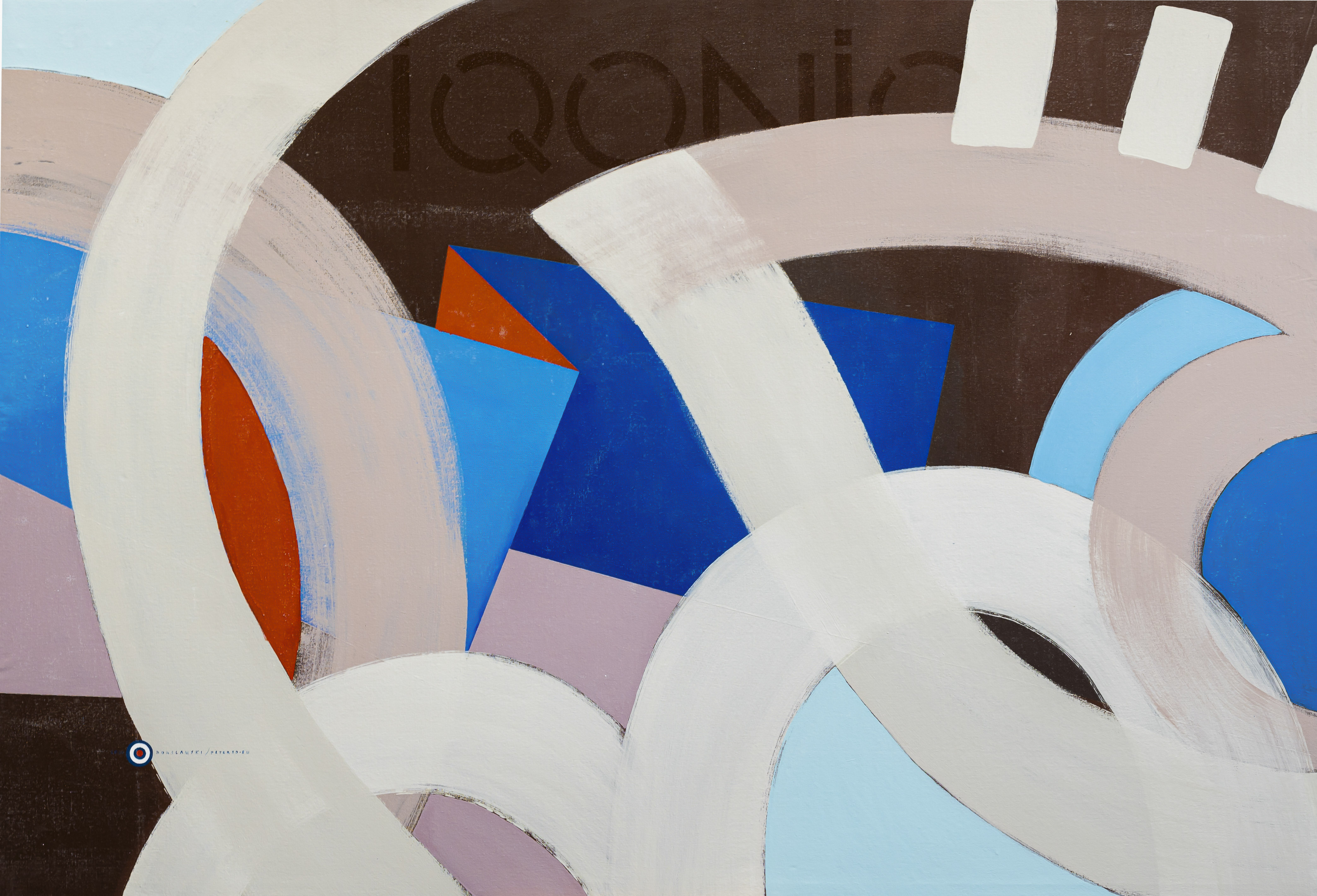
“Iqonic V. The Woman with Blue Eyes" Technique: Acrylic paint on canvas Size: 220 cm (width) x 150 cm (height)


Street love series
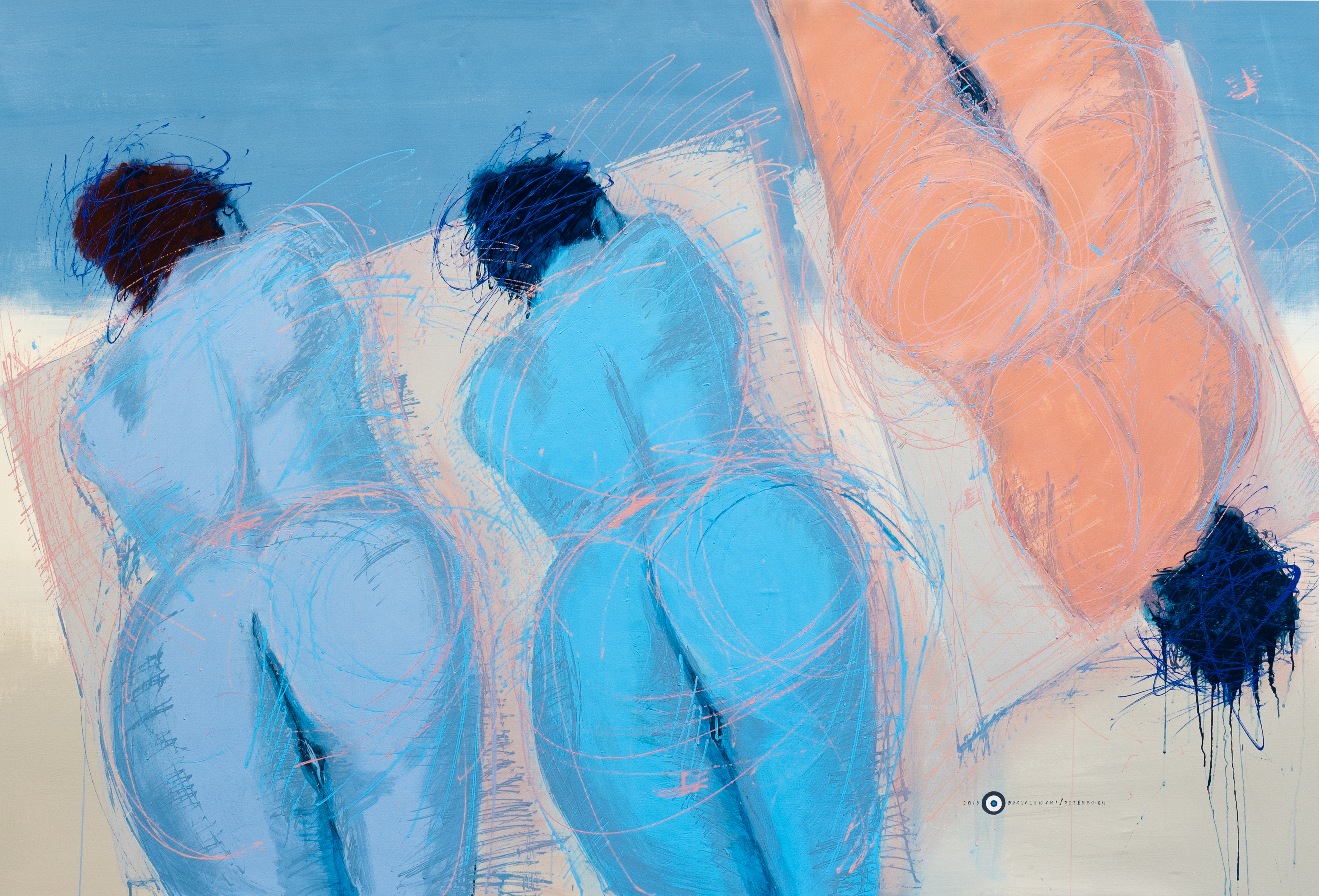
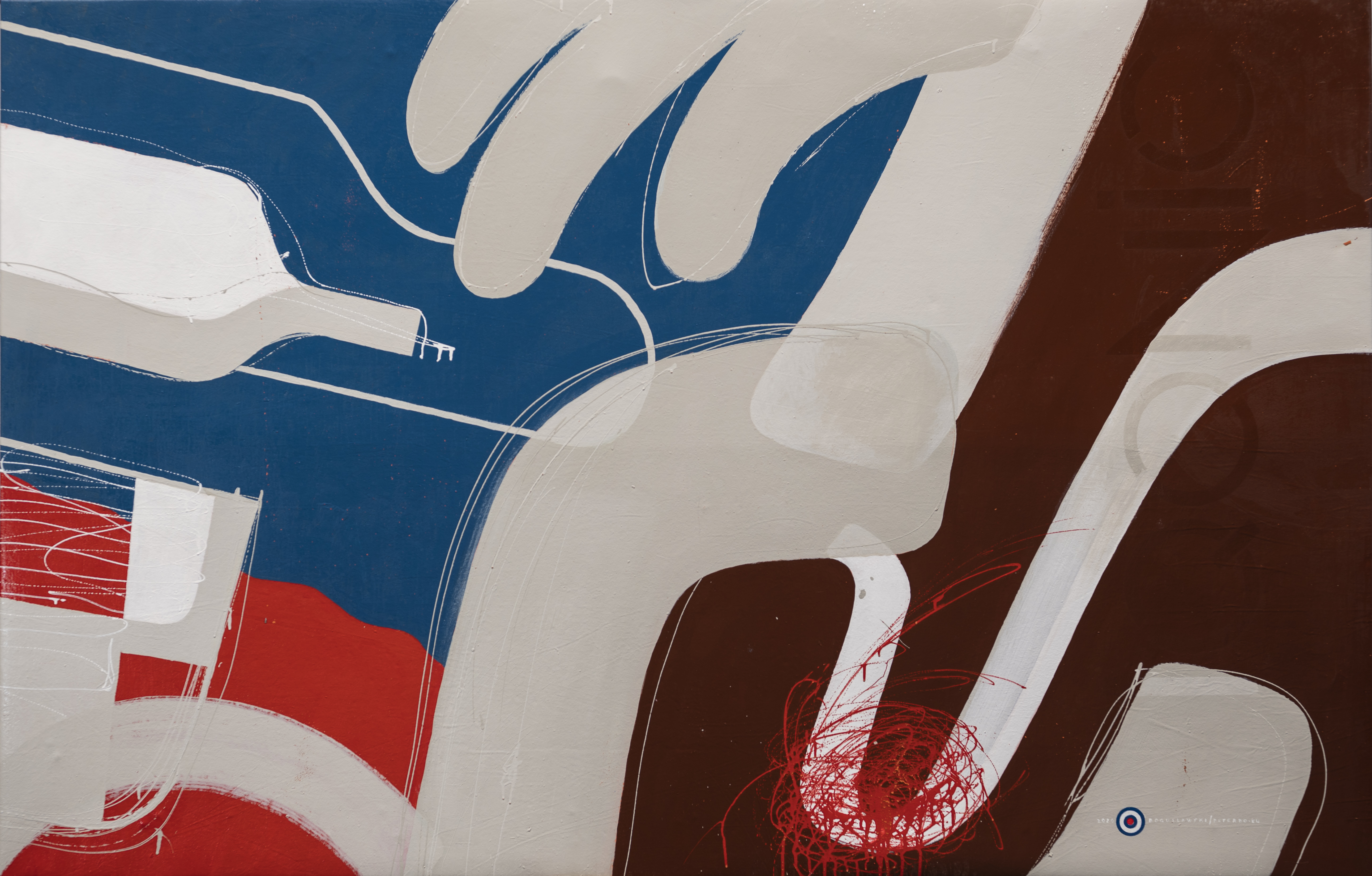
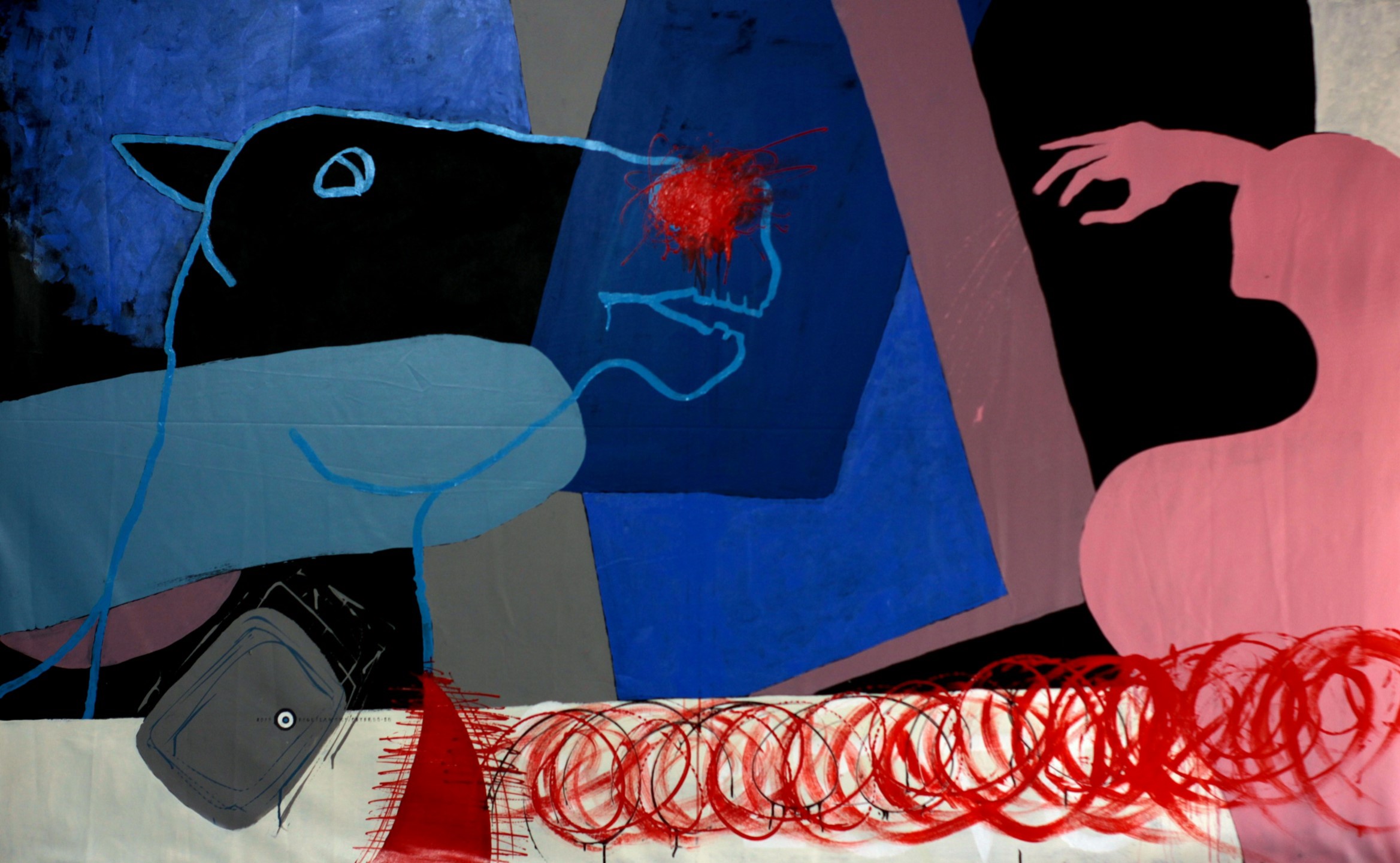
"STREET LOVE" is a short series of paintings related to the physical and emotional aspect of male-female relationships. The painterly reality of this series exudes violence, emphasized by shapes that symbolize emotional relationships, sex, passion, and addiction. Synthetic, thoughtful compositions represent the moment of the meeting and have their own dramaturgy in each of the paintings.
The expressive and symbolic nature of these works is emphasized by the appropriate range of colors: from deep blues through pastel grays, pinks, and purples to brown and intense reds. The red color plays a special role here: it emphasizes the compositional dominants and also introduces the appropriate tension, suggesting the dramatic nature of the scenes presented. The shapes of the hands also play an important role as a symbol of manipulation, as well as erotic accents.
It is worth paying attention to the element characteristic of the author - the intentionally placed, not very discreet title of the series in the lower part of the first work in the series. The motif repeated in the next two paintings is a spiral that introduces even more anxiety. The author consistently develops the topic of human sexuality and carnality as the foundations of love relationships of various degrees of intimacy.
These visions are deliberately simplified, reduced to a few well-planned contrasts and clear symbols, making it easy for us to recognize the meaning of this artistic message.
Street Love 1, technique: acrylic paint on canvas, size: 230 cm wide by 140 cm high

Visual Proportion: Street Love 1
Street Love 2 - technique: acrylic paint on canvas, size: 230 cm wide by 140 cm high

Visual Proportion: Street Love 2
Street Love 3 - technique: acrylic paint on canvas, size: 200 cm wide by 140 cm high

A Diverse Retrospective
"STREET LOVE" is a short series of paintings related to the physical and emotional aspect of male-female relationships. The painterly reality of this series exudes violence, emphasized by shapes that symbolize emotional relationships, sex, passion, and addiction. Synthetic, thoughtful compositions represent the moment of the meeting and have their own dramaturgy in each of the paintings.
The expressive and symbolic nature of these works is emphasized by the appropriate range of colors: from deep blues through pastel grays, pinks, and purples to brown and intense reds. The red color plays a special role here: it emphasizes the compositional dominants and also introduces the appropriate tension, suggesting the dramatic nature of the scenes presented. The shapes of the hands also play an important role as a symbol of manipulation, as well as erotic accents.
It is worth paying attention to the element characteristic of the author - the intentionally placed, not very discreet title of the series in the lower part of the first work in the series. The motif repeated in the next two paintings is a spiral that introduces even more anxiety. The author consistently develops the topic of human sexuality and carnality as the foundations of love relationships of various degrees of intimacy.
These visions are deliberately simplified, reduced to a few well-planned contrasts and clear symbols, making it easy for us to recognize the meaning of this artistic message.
“Birds" Technique: Acrylic paint on canvas + polyurethane Size: 200 cm (width) x 150 cm (height)
Visual Proportion: Birds

"AMOR Y MUERTE 2"Technique: Acrylic paint on canvas + polyurethane Size: 200 cm (width) x 150 cm (height)

"AMOR Y MUERTE 1" Technique: Acrylic paint on canvas + polyurethane Size: 200 cm (width) x 150 cm (height)